

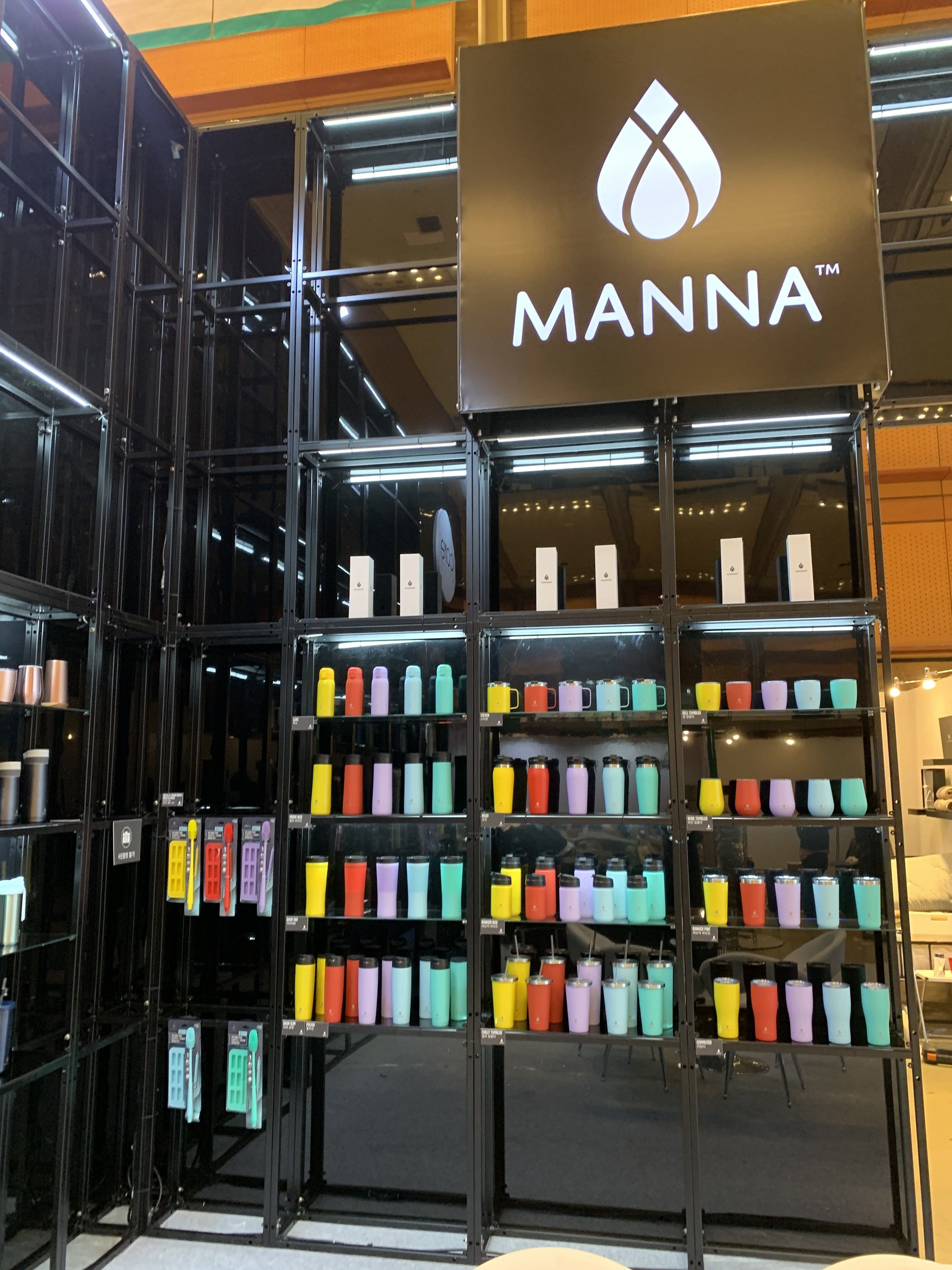


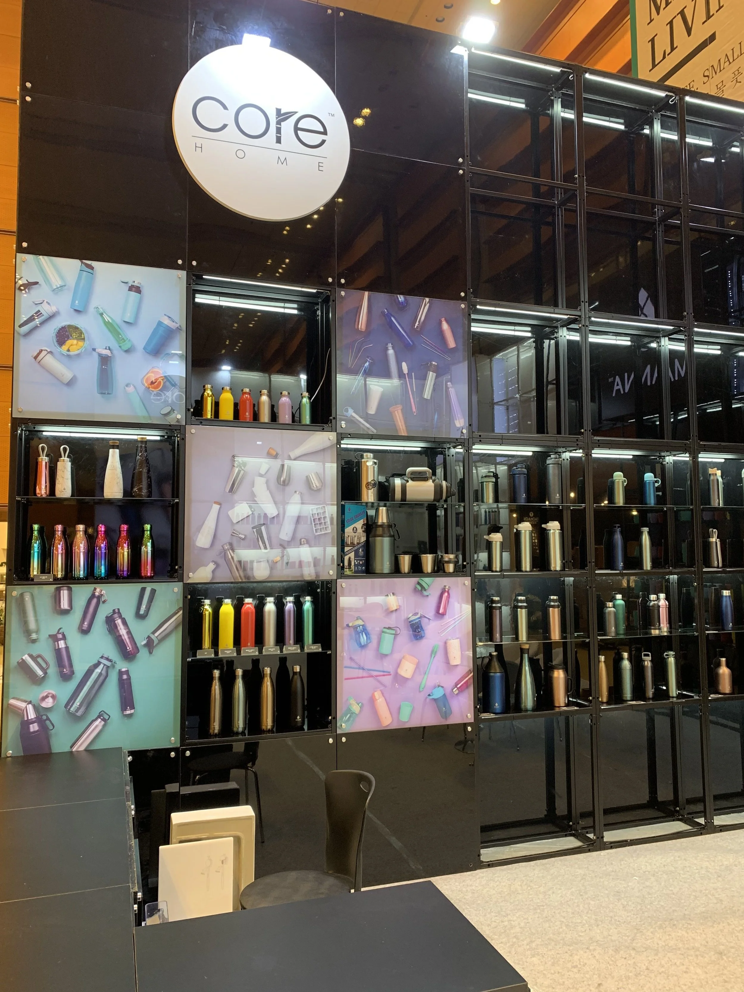


Seoul Living Fair has hundreds of booths, and like all other companies, we needed to make sure ours stood out and made people stop and look.
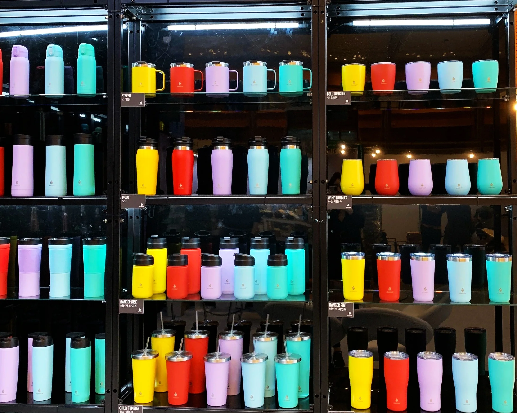
With so many different products and needing to showcase the different techniques that can be applied to said products, we had to make sure that the products would not get lost in themselves and become overwhelming to the visitors, while at the same time, it could not become overly simplified to the point where important information was lost. Playing off light and dark with bright and pastel, we came up with a color palette that would be easy for people to look at while drawing attention and bringing people into the booth. The juxtaposition of bright colors on the dark walls and the pastel colors on the while walls stopped people and brought them into the booth for a closer look.
The layout of the walls made it so that it was easy for people to come in and look without the feeling of being cramped or claustrophobic. It also created a nice flow to the traffic where people saw the minimal walls from the outside and came around to the open space to feel welcomed and have breathing space.